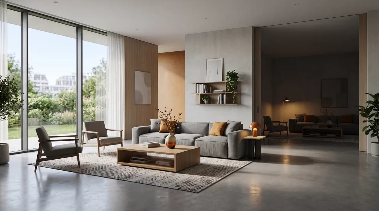
3D virtual tours have become standard practice in marketing high-value properties. Few listings for upscale homes go out today without a link to a Matterport tour or a comparable 3D walkthrough. And yet, in practice, the quality gap between tours is striking. Some walkthroughs feel like stepping into the property itself — bright, coherent, almost tactile. Others feel like navigating a maze of dim, distorted rooms that make visitors want to close the tab within seconds.
The difference rarely comes down to which software was used. Matterport, iGuide, and similar platforms all produce technically capable output. What actually separates a tour that converts from one that doesn't is the craftsmanship behind it: how the space was scanned, how the images were processed, and how the experience was structured for a viewer who has never set foot in the building. For agents, developers, and facility managers investing marketing budget in 3D content, understanding these factors is the difference between a tour that generates qualified leads and one that quietly gets ignored.
Exposure and HDR Consistency
The most common flaw in mediocre virtual tours is inconsistent exposure. Every scan position captures a slightly different lighting situation — a window catching afternoon sun in one corner, a shadowed hallway a few steps away. Without careful HDR (high dynamic range) processing, this produces a tour where some rooms are washed out and blown out near windows, while adjoining spaces sit murky and underexposed. The visual whiplash between scan points breaks immersion and makes the property look poorly maintained, even when it isn't.
Getting this right requires bracketed exposures at every scan position — typically three to five shots at different exposure values — merged into a single balanced HDR image. The skill lies in blending these brackets so that windows retain visible outdoor detail (rather than turning into flat white rectangles) while interior surfaces keep natural shadow and texture. Just as important is consistency from room to room: a viewer should experience a coherent, evenly lit walk through the property, not a series of disconnected lighting experiments. At FotoEstate, this consistency is treated as non-negotiable — it's the baseline that everything else builds on.
Scan Density and Geometric Precision
A second, less visible factor is how densely a property was scanned. Every scan point captures a sphere of visual data, and the software stitches these spheres together into a navigable model. The more scan points captured — and the more precisely they're placed — the smoother and more accurate the resulting geometry. Skimp on scan density, and you get warped doorways, floating furniture, walls that don't quite meet at the correct angle, or transitions between rooms that feel abrupt and disorienting.
Scan density matters most in complex spaces: multi-room layouts, staircases, irregular floor plans, and rooms with alcoves or built-ins. A rushed scan job might place a scanner every four or five meters to save time; a careful one places it every two to three meters, accounting for sightlines and obstructions. The additional time investment is invisible to a first glance at the finished tour, but it becomes obvious the moment a viewer tries to walk through a stairwell or peer around a corner — smooth, natural movement versus jarring jumps and geometric errors. For a property meant to convey confidence and value, geometric precision is table stakes.
Dramaturgy and Navigation Flow
Here's a factor that's often overlooked entirely: the order in which a viewer experiences the space. A virtual tour isn't just a collection of scan points — it's a narrative, whether or not anyone treats it that way. The starting point, the sequence of rooms, and the pacing of transitions all shape how a viewer perceives the property.
The best tours are choreographed deliberately. They typically open at the entrance or a strong exterior vantage point, establishing context and orientation before moving inward. From there, the sequence should follow a natural, intuitive path — the one a real visitor would walk — building toward the property's strongest spaces (a chef's kitchen, a primary suite, a standout view) rather than front-loading the least interesting rooms. Poorly sequenced tours, by contrast, often follow whatever order the scan happened to occur in, dropping viewers into a utility closet or a secondary bathroom before they've even understood the layout. This kind of disorientation is often what causes a prospect to abandon a tour within the first thirty seconds — well before they've seen anything of value. Thoughtful dramaturgy is invisible when done well, but its absence is immediately felt.
Careful Post-Production Instead of Visible Shortcuts
Raw scan data is never presentation-ready. Every scan point captures the tripod's base, and if left unedited, viewers will see a small triangular artifact on the floor or ceiling at every position — an unmistakable giveaway of a rushed job. Careful post-production removes these consistently, so the illusion of a seamless physical space holds up under scrutiny.
The same diligence applies to privacy and presentation. Personal photographs, mail, prescription bottles, or anything else that identifies the current occupants should be blurred or removed — both as a courtesy to sellers and as good practice for marketing a space as a blank canvas for the buyer's imagination. Color grading deserves equal attention: overly warm, orange-tinted rooms or oversaturated skies through windows are common tells of automated, unattended processing. Natural, accurate color reproduction — matching what a visitor would actually see standing in the room — builds trust in a way that artificially enhanced imagery erodes. Buyers who feel misled by a tour's color treatment often walk into a showing already skeptical, which undermines the entire purpose of the marketing asset.
Interactive Info-Tags as Added Value
A tour that simply lets viewers walk through rooms is useful; a tour that answers their questions along the way is genuinely persuasive. Interactive info-tags — small clickable markers placed within the scene — let agents surface exactly the information a prospective buyer or tenant is looking for, right at the moment they're looking at the relevant feature.
This might mean noting that the kitchen countertops are quartz, that a particular window was recently replaced, that the building has fiber internet, or that a given room qualifies as a legal bedroom under local code. For commercial and multifamily properties, tags can convey square footage per unit, HVAC zoning, or lease terms directly tied to a space. Done well, this transforms a virtual tour from a passive walkthrough into an interactive information hub — reducing the number of back-and-forth questions an agent has to field and letting serious prospects self-qualify before ever scheduling an in-person visit. Tours that skip this feature leave value on the table; they could be doing far more work for the marketing budget already spent on the scan.
Dollhouse View and Floor Plan Integration
One of the most valuable features a modern virtual tour can offer is the dollhouse view — a 3D, bird's-eye rendering of the entire scanned space that lets viewers see how rooms relate to one another spatially. This solves a problem that room-by-room walkthroughs alone cannot: understanding overall flow and layout. A viewer might love the kitchen and the primary bedroom individually but have no sense of how far apart they are, or whether the property has an awkward pinch point between public and private spaces, until they see it from above.
Pairing the dollhouse view with an accurate, to-scale 2D floor plan closes the loop entirely. Serious buyers — and especially commercial tenants or investors evaluating usable square footage — consistently cite the floor plan as one of the first things they look for. A tour without one forces viewers to mentally reconstruct the layout from a linear sequence of rooms, which is cognitively taxing and leaves room for misjudgment. Integrating both views turns the tour into a genuine planning tool rather than just a promotional walkthrough, and it signals a level of thoroughness that reflects well on the listing as a whole.
Load Time and Mobile Performance
All of the craftsmanship described so far can be undone by one thing: a tour that loads slowly. A meaningful share of prospective buyers and tenants first encounter a listing on a phone, often over a mobile connection rather than home Wi-Fi. If the tour takes ten or fifteen seconds to load its first scene, a large percentage of viewers will simply back out before they see anything at all — no matter how good the underlying content is.
Well-built tours are optimized for this reality: compressed but high-fidelity imagery, progressive loading that shows something usable within a second or two, and interfaces that are genuinely touch-friendly rather than a desktop experience awkwardly squeezed onto a small screen. This is a technical detail that has nothing to do with photography skill and everything to do with the platform and delivery pipeline behind the tour — but it has an outsized effect on whether prospects ever see the careful work described in the sections above. A beautifully shot tour that loads slowly on mobile is, in practical terms, a tour most people never experience.
Consistency Across a Whole Portfolio
For developers, brokerages, and property managers producing virtual tours at scale — dozens or hundreds of units across multiple properties — a further dimension of quality comes into play: consistency across the entire portfolio. A single excellent tour is one thing; maintaining that same standard of exposure, scan density, dramaturgy, and post-production across every unit in a 200-unit apartment complex or every listing in an agency's portfolio is another challenge entirely.
Inconsistency across a portfolio undermines brand credibility in a subtle but real way. If one unit's tour is crisp, well-lit, and thoughtfully sequenced while the next one looks rushed and murky, prospects notice — and it raises doubts about which version reflects reality. Standardized shot lists, consistent HDR processing pipelines, and quality-control review before publishing are what separate operations that scale virtual tours successfully from those that produce an uneven, hit-or-miss library of walkthroughs. This is an area where a professional partner's internal process matters as much as any individual tour's execution.
Conclusion
A virtual tour is far more than a novelty add-on to a listing — done well, it's one of the most powerful trust-building and lead-qualifying tools available in real estate marketing today. But the difference between a tour that converts and one that gets abandoned within seconds rarely comes down to the software. It comes down to disciplined exposure work and HDR consistency, sufficient scan density for accurate geometry, deliberate dramaturgy that guides viewers toward a property's strengths, careful post-production that removes shortcuts rather than leaving them visible, interactive info-tags that answer questions in real time, an integrated dollhouse view and floor plan, fast and mobile-friendly load times, and — for larger operations — consistency maintained across an entire portfolio.
For agents, developers, and facility managers evaluating a virtual tour provider, these are the questions worth asking before committing budget: How is exposure handled across scan points? What's the typical scan density for a property of this size? Is there a deliberate plan for sequencing the walkthrough? Is post-production reviewed for artifacts and color accuracy? Are interactive tags and floor plans included? And how does load time perform on an average mobile connection? These aren't minor technical footnotes — they're the factors that decide whether a virtual tour becomes a genuine sales asset or a piece of marketing collateral that quietly underperforms. At FotoEstate, every one of these details is treated as core to the craft, not an afterthought.