Floor Plan Mistakes That Put Buyers Off
Eight typical mistakes in brochure floor plans, what they trigger in the viewer and how each of them can be fixed with reasonable effort.
After the header image, the floor plan is the second most viewed element in a property brochure. It is also the element at which most prospective buyers drop out. Not because the flat is badly laid out, but because the presentation prevents them from understanding the layout at all.
The difference between a floor plan that sells and one that puts people off rarely lies in the property. It lies in presentation decisions that could be made differently in a few minutes.
This article works through the mistakes we encounter most often in the documents sent to us — and what they trigger in the viewer.
Mistake 1: The scanned building permit drawing
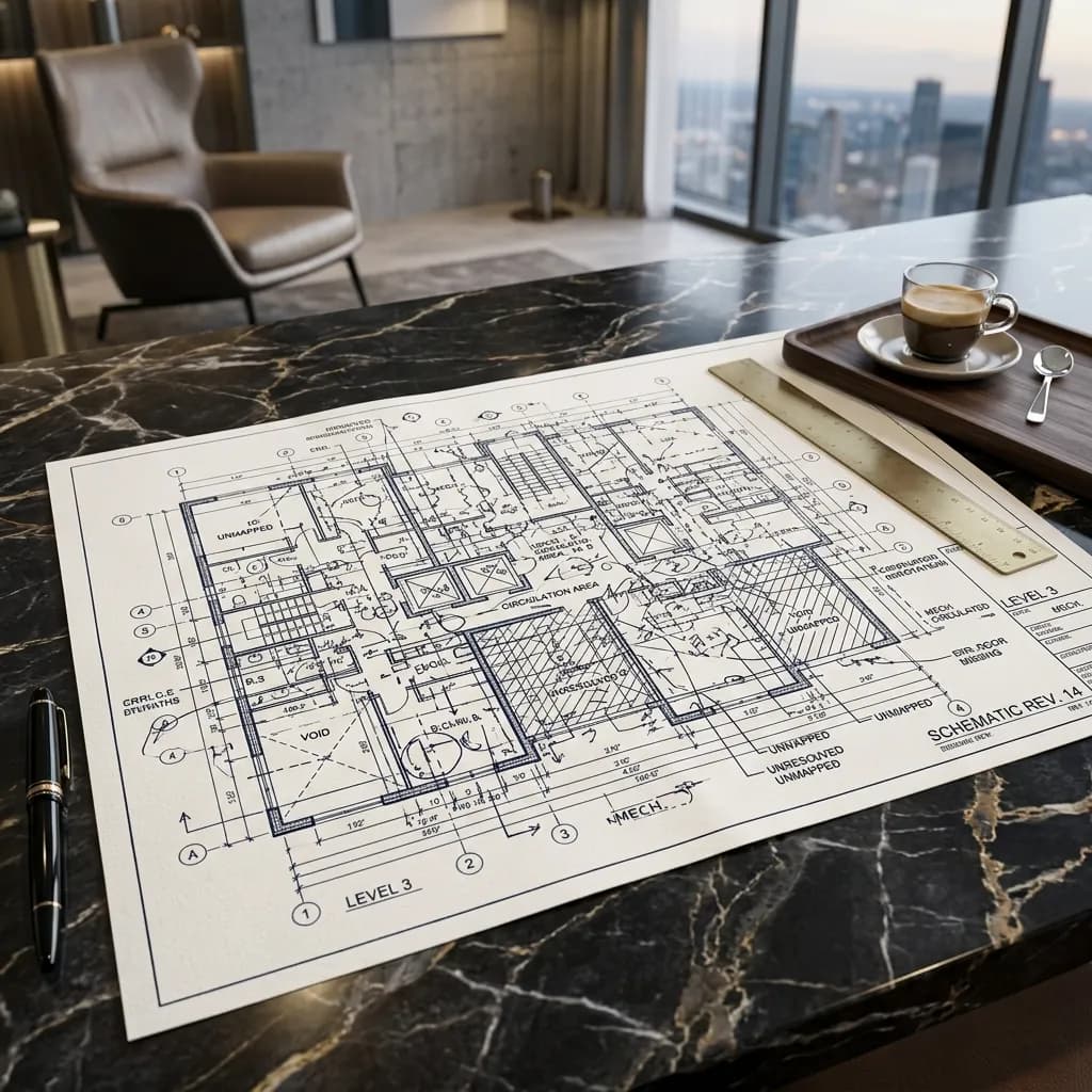
By far the most common case. The floor plan in the brochure is a copy from the planning application: black and white, dimension chains on three levels, an axis grid, section lines, position numbers, structural notes, a north arrow in one corner and the practice's title block in the other.
For the planning officer that is the right drawing. For a prospective buyer it is a wall of information in which the one question they care about disappears: how is this flat laid out?
A marketing floor plan contains less, not more. Room names, room sizes, doors and windows, orientation — the rest is ballast. Dimension chains from working drawings do not belong in a brochure, because they make a promise of precision that is neither necessary nor helpful for marketing. What else to consider is set out in our article on floor plan optimisation.
Mistake 2: No scale, no size information
A floor plan without numbers is a picture of lines. The viewer cannot judge whether the living room is 18 or 30 square metres.
What happens then? They estimate — and usually estimate too low. People systematically underestimate rooms on plans, because they relate the area to the area on their screen rather than to metres.
The remedy is unspectacular: room size beneath every room name, plus at least one edge length for rooms whose proportions are decisive. A 20-square-metre room measuring 6.5 by 3.1 metres is a different room from one measuring 4.5 by 4.5 metres. Giving only the area withholds precisely the information that determines whether the room can be furnished.
For area figures one rule applies: state the basis of calculation. Living area under the German Living Space Ordinance and floor area under DIN 277 are different numbers for the same flat. Mixing the two produces follow-up questions at best and disputes at worst.
Mistake 3: Missing or incorrect orientation
A floor plan without a north arrow conceals when each room gets sun. For a substantial share of buyers that is a knock-out criterion — and one they do not ask about, they simply never enquire.
More common than the missing north arrow is the rotated plan. The drawing was turned 90 degrees to fit a landscape layout, and the north arrow either turned with it or did not. If it did not, the brochure now contains a false statement about daylight.
Where possible, add the path of the sun, or at least the orientation of terrace and balcony in the text. "South-west facing balcony" is one of the few details buyers actively search for.
Mistake 4: A floor plan without any context
A single storey, cut out, with no relation to the building. For a flat on the third floor of a building with seven units, half the orientation is missing: where is the stairwell? Where does the flat sit within the building? Does it adjoin the lift shaft?
With multi-storey properties — terraced houses, semi-detached houses, maisonettes — it gets worse. Two levels as two separate images in the brochure, with no way to tell where the staircase arrives on the upper level. The viewer has to superimpose the levels mentally. Most do not.
Place multi-storey plans side by side on one sheet, in the same orientation and at the same scale, with the staircase as a visible connecting point. That is twenty minutes of layout work and removes one of the most common obstacles to understanding.
Mistake 5: Furniture that makes the room smaller
A furnished floor plan is meant to show that the rooms work. It can achieve exactly the opposite.
We see two patterns again and again. First: the furniture is too large. A correctly scaled double bed is 2.00 by 1.80 metres. If that leaves 40 centimetres between the bed and the wardrobe, the plan has just proved to the buyer that the bedroom is cramped.
Second: the furniture is too small. A sofa that looks like a two-seater on the plan but would in reality be 1.20 metres long makes the room appear larger than it is. That comes out at the viewing, and then the problem is not just the room but confidence in every other figure you have published.
Furniture on a floor plan has to be to scale and must not stand closer together than people would actually live. Circulation space belongs visibly free: in front of wardrobes, around the dining table, along at least one long side of the bed. More detail on this is in our article on floor plan staging.
Mistake 6: Illegible on a phone
Most portal traffic is mobile. A floor plan laid out as an A3 PDF with eight-point labelling is a grey surface on a phone screen. The viewer zooms twice, fails to find the room names and scrolls on.
Check every floor plan on a phone before it goes online. Specifically: are the room names legible without zooming? Can you see at a glance where the entrance and the bathroom are? If not, the labelling has to get larger and the number of elements smaller.
An often overlooked consequence: vertical plans work better on mobile than landscape ones, because the display is held upright. If the layout allows it, a portrait version alongside the landscape one is worth the effort.
Mistake 7: Every floor plan looks different
In developer projects with several unit types, the plans often come from different sources: some from the architects, some produced later by the sales team, some from an old presentation. The result: different colours, different line weights, different fonts, different furnishing styles.
That does not just look untidy, it makes comparison impossible. A buyer weighing up unit 7 against unit 12 has to be able to read both plans the same way. If one is colourful and furnished and the other black and white and empty, the furnished one wins — regardless of which is the better flat.
Define a presentation standard for the project and apply it across every unit. That is one-off work with an effect across the entire marketing period.
Mistake 8: 3D for its own sake
Three-dimensional floor plans are a good tool when they answer a question the 2D plan leaves open: how high is the sloping ceiling? How does the open-plan living and dining area work? How is the gallery connected?
They are a poor tool when they are meant to replace the 2D plan. In a 3D view, walls conceal parts of the room, dimensions are harder to read, and comparing several units becomes laborious. Offering only a 3D plan takes away the tool buyers actually plan with.
The approach that works: 2D as the basis, 3D as a supplement for the rooms or storeys where the spatial effect is the real message. Which version fits when is covered in more depth in our 2D versus 3D decision guide.
What a floor plan cannot do
Honesty requires the other side too. A well-made floor plan does not fix a bad layout. If the bathroom is only accessible through the bedroom, if a room has no windows, if the flat designates a walk-through room as a children's room — the buyer sees that, and they should see it.
Attempts to disguise such points through clever presentation regularly backfire. Omitted doors, deliberately confusing room labels or furniture suggesting an impossible use all come out on site at the latest. The damage is then greater than the original drawback, because it transfers to the credibility of every other statement you have made.
A floor plan may explain a difficult layout well. It must not hide it. And sometimes the better answer is to name the difficult point openly in the brochure text and supply an idea for using it.
A short check before going online
- Room names and room sizes present for every room
- Basis of the area calculation stated
- North arrow present and matching the actual orientation
- Multiple levels shown together, at the same scale, staircase identifiable
- Furniture to scale, circulation space free
- Legible on a phone without zooming
- All units in a project presented consistently
- No dimension chains or title blocks from the planning application
- Balcony and terrace areas visible and labelled as such
Conclusion
Floor plans are treated as a technical add-on in property marketing and are in fact a sales instrument. The mistakes that cost the most are not fine points of design but missing basic information: no sizes, no orientation, no relationship between levels, illegible on the device it is read on.
Every one of these points can be fixed with reasonable effort. And unlike a photo shoot, none of it requires going back to the property.
How we prepare floor plans for marketing is shown on the page about 2D and 3D floor plans.
Related articles
Explore 2D & 3D floor plans
See what the service includes, which source material is useful and how a typical project starts.