The 5 most common mistakes in floor plan staging and how to avoid them
How to achieve maximum results with floor plan staging and save valuable budget.
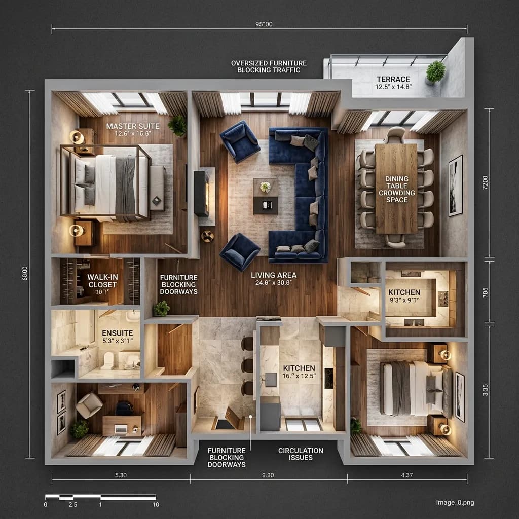
A dimensioned, clearly structured floor plan is, alongside the hero photo, the most important document in any real estate exposé. It provides the hard, non-negotiable facts about living space, room layout, and functionality. However, bare, two-dimensional black-and-white plans straight from the architect's CAD program are barely interpretable for 90 percent of prospective buyers. The solution is called floor plan staging (often also referred to as 2D/3D coloring).
Through color preparation, three-dimensional shadowing, and the drawing of stylized furniture, the technical plan becomes an emotional sales tool. But caution: serious mistakes can happen during the transformation from construction plan to sales asset. If floor plans are prepared incorrectly, not only can property viewings be abruptly canceled, but in the worst case, legal consequences may arise. We highlight the five most fatal mistakes in floor plan staging in the B2B environment (very similar to the costly mistakes in cinematic real estate videos that can impact sales success).
Error 1: Unrealistic Furniture Dimensions (The Size Illusion)
The main purpose of the example furniture shown is to give the buyer a sense of room sizes and available space ('Will my double bed fit here?').
Why this fails:
Often in staging, beds, sofas, or dining tables are deliberately (or out of ignorance) scaled and drawn unnaturally small to make a tiny, 10-square-meter bedroom appear like a ballroom on paper. The double bed suddenly only has a length of 1.40 meters on the plan.
The B2B Solution:
This is simply buyer deception. At the latest, during the actual viewing, comes the rude awakening, trust in the real estate agent drops to zero, and the deal falls through. Professional floor plan staging at FotoEstate uses only standardized, real standard measurements (e.g., 2.00 x 2.00 m for a double bed). This ensures absolute transparency for you as an agent and protects you from claims for damages due to misleading listing information.
Error 2: "Visual Clutter" (Overload through decoration)
A floor plan is primarily intended to provide orientation. Too many details distract from the essentials (the walls, doors, and the area).
Why this fails:
Many staging providers want to appear particularly 'photorealistic' and draw every carpet, busy tile pattern, potted plant, coffee cup on the table, and towel in the bathroom into the 2D floor plan. On the small smartphone display of the ImmoScout searcher, this merges into a completely confusing, illegible riot of colors (visual clutter).
The B2B Solution:
Less is more (flat design approach). When staging, we focus on the essential key furniture (bed, sofa, dining table, kitchenette) to clearly define the function of the room. The spaces in between (whitespace) are deliberately kept calm so that the natural walking paths and the spaciousness of the architecture can be immediately perceived.
Error 3: Ignoring building physics details (wall thicknesses & doors)
A floor plan remains at its core a technical drawing, which must be simplified but in no way distorted in terms of building physics.
Why this fails:
Often, when "tracing" old sketches, all walls are drawn with a standard pen (e.g. 10 cm thick). The difference between a solid, 30 cm thick load-bearing outer wall and a light drywall is lost. In addition, window openings are ignored or doors are drawn without an impact radius (the "door swing").
The B2B solution: Buyers want to know which walls they might potentially be able to break through later. Load-bearing walls must be represented in staging as thicker or color-distinguished (e.g., dark gray) than light interior walls. Door radii are essential so that the buyer can see if the open door will later block their wardrobe.
Error 4: Illegible dimensioning and incorrect contrasts
Nothing is more frustrating than a visually appealing floor plan on which you can't decipher the square meter numbers.
Why this fails:
The font size is too small, or the black dimensioning text lies directly on a dark gray bathroom tile texture. Often, dimension lines also overlap the newly drawn furniture, which makes the plan look busy and unprofessional.
The B2B Solution:
Text overlays necessarily require high contrast. FotoEstate places room labels and square meter information in large, sans-serif fonts. If the background is dark, the text receives a white outline (halo) or is placed in a transparent, white text box. The dimension chains (length/width of the walls) are displayed subtly but clearly recognizable at the edge of the plan.
Error 5: No CI Adjustment (Corporate Identity)
Real estate agencies spend thousands of euros on their branding (logo, company colors, fonts). But they often skimp on the floor plans.
Why this fails:
If the floor plan looks like generic stock material or completely deviates from the color scheme of the rest of the landing page or the print brochure, a break in the brand image occurs. As a result, a premium property immediately appears like cheap mass-market distribution.
The B2B Solution (White-Label Staging): A floor plan is a marketing tool. PhotoEstate adjusts the color scheme (the color codes) of the floor plans exactly to the corporate identity of your real estate agency upon request. In addition, we subtly integrate your company logo into the plan. When the customer prints or saves the floor plan, your brand remains constantly visible.
Conclusion: The Balance of Precision and Emotion
Successful floor plan staging is the art of combining legally secure technical precision with homely, sales-stimulating aesthetics. Those who avoid these five B2B mistakes transform building plans into real sales accelerators.
Do not leave the preparation of your most important documents to chance or exaggeration. Use the expertise of FotoEstate to create color-coded, standardized, and CI-compliant floor plans (in 2D and 3D) that strengthen your buyers' trust and demonstrably shorten the marketing period.
Related articles
Explore 2D & 3D floor plans
See what the service includes, which source material is useful and how a typical project starts.